Marc Marc

M2Font
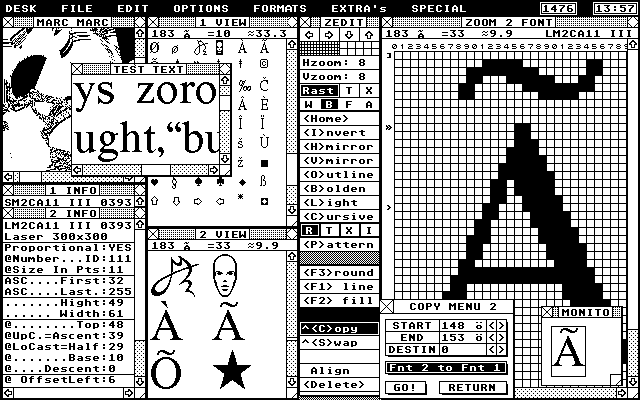
Duo GEM Font editor

Manifest
This release was meant to be a manifest against the ease of software developers in the way they implement in a criticless manner the illusion of user friendly conventions and by this bind all of us for many years with horror and rigid software.

Still relevant
Each of the listed features about M2font are actually features that other font programs did lack at the time and proved that convenience first of all relies on logic and in the last place on technical matters.

You might think that this story is old because it handles about a computer platform that already is more than 10 years old (the Atari St). In a way this is true but, in its essence nothing seem to have changed - no matter what platform you working at; the horror of 'user-friendly' software remains. Now, already some years working on a pentium under windows and also excursions to other platforms, I see exactly the same mismatch between the ideas and the realisation. This not only concerns the application writers but also the operating system writers (Microsoft seem to have patent on hiring the lowest gods to write for their system).

Reading about the features of M2font, although they might not directly of your concern, will put you on questions why the software you are using right now, also lacks some user-friendly and really-thought-about functions, options and way of treats.

Release
M2font was written in 1994, for the Atari ST computer (PC or whatever owners should also keep on reading :-) It was released as a Public Domain (freeware) and is still available in the Public Domain (without the printed manual).

Fight
Due to a fight with the Apple company, the Atari ST GEM window system allowed to only have 4 windows to be opened. M2FONT solved with this problem by having complete inline intergrated window, desktop and dialog system on board. A faster and more intelligent graphic manager than the original GEM. Although I can not say that programming a completely new graphic interface is an easy job, it turned out to be possible within a week. Its makes you wonder what the programmers were doing when they designed the 'ATARI' window GEM system and also makes you wonder what the hell software writers are doing today (smoking grass?). Joking I gess.


menu pic

The reason why
At the time I've got a laser printer at my table and wanted to start with redesigning documents and manuals with more sophisticated DTP software, I was not very satisfied with the fonts that were available. I wanted to make my own and did try several font edit programs. This was a horrorble thing to do. They all seem to be designed to only change once and a while a small detail. Not for really editing a whole font, starting from nothing. I figured that first writing my own software and then making the fonts that I had in mind was faster than to continue with the available font edit programs. So I did and the result was not bad at all.


# Specialities.       # Comfort.

Lees Artikel uit Atari ST over M2FONT


. . . . . Specifications . . . .

  • Version: April 1994 Version 1.14

  • Memmory: At least 1 Megabyte (better 2Mb or more).

  • Resolution: Monochrome only (640x400)

  • Format: Standard GEM font files (non-compressed).

  • Capacity: 2 font's completely independently (max 400x400 points). Each font has its own window(s).

  • Edit: Both fonts are entirely editable without complicated and time-eating hocus pocus (as new data loading when resizing the font).

  • Matter: of taste: The outlook of the windows and Drop Down/Pop up menu's can be customized.

  • Clock: A Clock is available at the desktop - can be edited and also removed. The moral: any window you do not need/want can be deactivated to suits the complexis/simplicity of your desktop to your needs.

. . . . Specialities . . . .


  • Fast: It never can be fast enough!. A lot of attention is paid to speed to let the user wait as less as possible (to drink less coffee). A quater-of-a-second-response is seen as a crictical time value - even when a lot of work need to done by the program. Tha'ts why the code was partly written in assembler and most of the code in so called machine-basic code (compiler optimized code).

  • Capricious: Everybody has its own prefered and mabey even irrational way of working with the mouse when selecting functions. You have fast or slow double clicks, single slow clicks, clickthrough or click while moving habbits? M2Font simply recognizes your way of working automaticly by using a smart-mouse-handler. Also, a running selection sequence that you all of a sudden break off because you decide to do something else is recognized. M2font simply sees that you are not interested anymore in continuing a process and skips it without you have to deal with all kind of obvious garbage dialogs that are asking for an OK. when it really is important to verify your choices - M2font will. Jesus! this still is not a common way on any computer!

  • Interaction: To achieve flexible working wiht the windows, menus and dialogs the use of GEM (General Enviroment Manager) is avoided as much as possible. Most enviroment functions are replaced with my own in-line system. This has lead to a system wherein the good things of GEM are combined with things that not only are handy in theory but also in practice. This also has a disadvantage but, about this later.

  • Windows: Maximal 9. Anti_stress: Invisible screen and window redraw. Automatic selection of windows without this being noticable for the user (the houskeeping actions of the system is not visible).

  • AREA: One of the highlights of 'M2Font' is the AREA function. About all operations on a single character or groups of characters; the user can define an Area (segment) in the character to which the operation should be effective.

  • Pictures: In an individual window you may laod a picture. With this you can capture (grab) parts to serve as a character in the font. Also you can use this window to load some explanation pictures about how fonts are build up and you can store the screen at any moment to this picture window with +F (fixate) and save it to disk.

. . . . . Comfort . . . . .

  • Matrix: The build-up of the zoom-matrix is fast! when drawing freehand into the matrix it can follow you moves fully! So, you can now really draw fluent lines into the matrix. With some practical keyboard commands you can quickly and adequatly change from characters and also manipulate them.

  • Annuleren: In all surcomstances you can cut running processes or dialogs by hitting the ESC key or to click with the right mouse key.

  • Test: The fonts can be tested in a build-in test text window. You then can test how the characters are doing into a real text. This test text can be saved and of course also be loaded.

  • Series: with the [-] and [+] keys, the zoom matrix goes one character back or forward. With the ['] key you change between one and the other font (to easy compare the characters from both fonts in the zoom matrix).

  • Keyboard table: The implementation of the keyboard table is far way done more friendly that you are used to up to now.

  • Proportions: With the Compare function the two fonts can be tested on differences and proportion consistence. This is very handy to keep a good relation between screen font and printer font. You get a rapport with notification wether characters are too small, too wide, acceptable or fully correct. In this rapport screen you also can make changes straight away.

  • Undo: To cancel the last edit action and an 'Undo' to bring back the original pre-edited character.

  • Monitor: A monitor window shows you directly the changes in the Zoom matrix - projected in real 1 to 1 size to easily see the result of your actions clearly.

  • Lines: LINE/ROUND: putting lines and circles/ellipses (or removing them) in any thickness or line style. Also a series of start points can be connected (draw) to a series of end point to draw quickly irregular shapes. This function is extremely easy to use and effective!

  • Dots: The way you like to put black or white dots into the matrix can be choosen in 4 different methods. One of them should fit to you or what you are used to.

  • Zoom style: The way dots look in the matrix can be customized in one of the 9 available styles.

  • Zoom factor: The zoom factor into the matrix can be adjusted for both the vertical and horizontal axis independtly from a factor 2 upto 32. Zooming the character into the matrix and scrolling the matrix at large fonts is done with the fast LINE_A BITBLOCK transfer methode. When using a blitter chip this even goes more fast and when the horizontal zoom factor is 8, 16 or 32 M2font switches to a special developed machine language routine to speed up even more (for large font you will notice this speeding up very well).

  • Copy: In a very simple way you can copy a character, a series of characters or the whole font. You also only can copy defined areas from it. The copy destination font may be of a different size than the source: M2font will prompt you how to deal with schrinking or expanding the font. You also can do all these manipulations in 4 different graphical modi (replace, transparent, Or and Xor). With this you can created quickly interesting variations of a single font.

  • Swapping: With the Swap function you can swap characters from position. You can also swap characters between the two fonts.

  • Alignment: To align the characters within a font horizontally and vertically a whole package of tools is available (ALIGN). You can align a single character, series or the whole font. This alignment tool is important to create a consistent looking font or to change the alignment rules of your font depending on the implementation into the wordprocessing program which you are using.

  • Shifting: You can shift very easily a character horizontal or vertical by using the cursor keys. The result is shown real time. You also can do this for the whole font or only a series of characters. Extremely usefull is the shifting within only a defined Area of the character. Ever did try, for example, to make the character 'H' smaller or wider with the conventional programs? If so, then you are definitely going to appreciate this function.

  • Delete: To delete or clean only a specific part of a character is very easy: first quickly define the area you like to clean and then hit the delete key. In combination with the character selection keys and this area clean you can easily walk through a whole font and remove everywhere the same pre-defined area. You even can do this area-clean for a series of charaters or the whole font in one action automatically.

  • Fill: With the Fill function you can fill areas in the character or it surounding with a choosen pattern. The area function in this case acts like a clipping border.

  • Patern: A character, a part of it, a series of characters or the whole font can be combined with a chosen pattern (rendered with the pattern). This allows to create fancy fonts and also is very practical to create draft fonts in one single action.

  • Cursive, Skew and Bend: The CURSIVE function lets you manipulate characters with effects. Not only to create a Cursivated variation of the character but also all kind of bending and skewing effects are included. They all can be used in context to the 4 graphical modi to created creative fonts in a quick and single run. This 'Cursive' menu by the way is problably the most difficult item in the M2font program, so on this you need to study a little extra. The manual has extra examples on this!

  • Mirror: Of course a Mirror (rorriM) function is available for both the horizontal and vertical axis. And: as with all other functions; this works in any graphical modus, on areas, single character, series of characters or the whole font at once. Besides the practical use of this function it also has great potency to create effect-fonts.

  • Bold & Light: With the BOLD function you can make your character or font more FAT and with the LIGHT function it becomes thinner. These functions also are functional in combination with the area function.

  • Contour: With the OUTLINE function you can outline a character, a series or the whole font at once. This function also works in combination with the area function.

  • Compress: fonts can be compressed and decompressed. You can customize the rules for this function. This function lets you change a font from proportional easily to non-proportional and the other way around.

  • Header info: The header information of the font can be viewed and changed at any time. Changing certain parametrs in the header may cause M2font to prompt you that this implies the nessecity of also changing the font and proposes this to you to do so. To edit the header you simply click at the line you like to change. Then you can edit the parameter and with the return key to fixate the new value. A hit at the right mouse key will cancel any change.

  • Study: With help of the 'Show Both Headers' option you can have a view at the non-modified header info and you can change it too. This can be usefull to detect errors in the header info when a font can not be loaded correctly - either due to a real data damage or by non-conventional header implemention by programers who want to protect their fonts or even worse; simply did not understand all of its parameters impact (this is proved to be the case in the manual of M2font).

 
Back to soft index . . . . . Back to main index

For response see Marc Marc contact file

This page & contents is Copyrighted (C)1996 by Marc Marc Amsterdam